Game UI: Trials of the Blood Dragon

As the Lead UI Artist of this project, I was responsible for the quality and delivery of the menus. I worked closely with fellow UI Artist Oleksandr Osovskiy, who created graphics and implemented the menus. This was a collaborative project between Redlynx and Ubisoft Kiev.
HUB
The menus are centered around the HUB represented as the characters' HQ. The game has a stronger narrative than previous Trials games and a fixed amount of features, so we went for diegetic menus with 2D overlays when needed. The first step was to think about the room layout and navigation, how the room would pan, and the items that would represent feature selections. We created wireframes, made mockups of the menus followed by prototypes.
Below: Rough wireframe of HUB (by Oleksandr Osovskiy)

Below: The HUB at start and end of the game. As the game progresses, the room gets filled with unlocked items and achievements.


HUB sub-menus:
What is Trials of the Blood Dragon?


Room concept: Juhani Jokinen
3D model: Tomi Väisänen
Lead Artist: Vaidas Bagonas
Mockups
I made the following mockups for the "Track Selection" menus.
The approach was to make the menus look playful while having different color schemes according to the theme of that particular world.


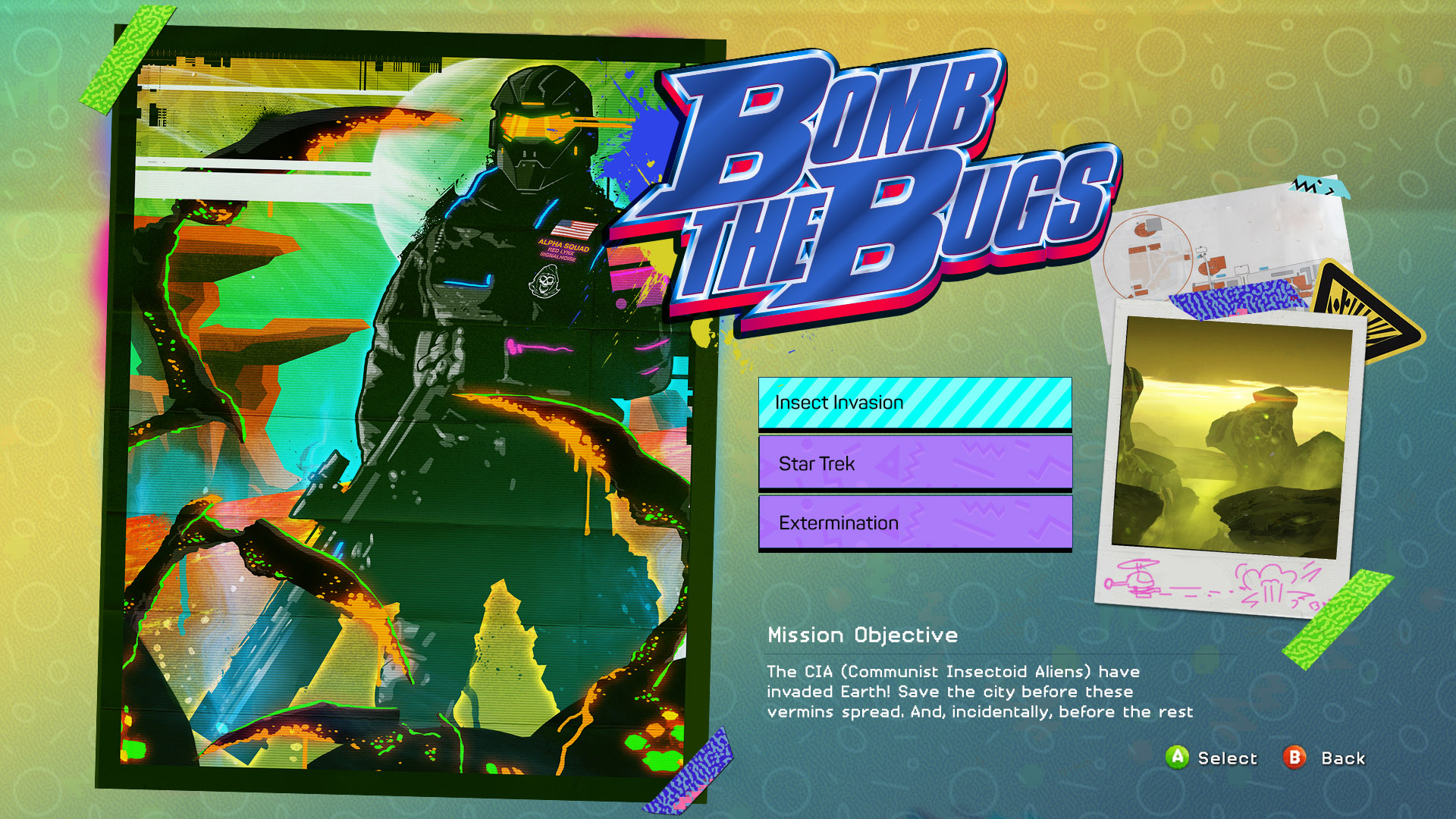
Poster artwork: James White
Logos by: BLOOD + CHROME
Motion Graphics
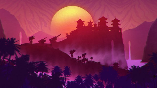
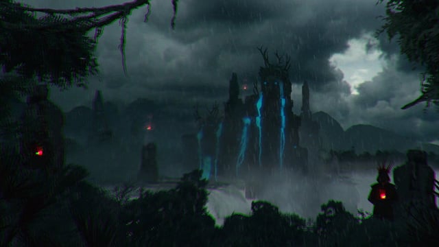
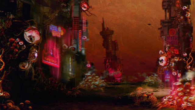
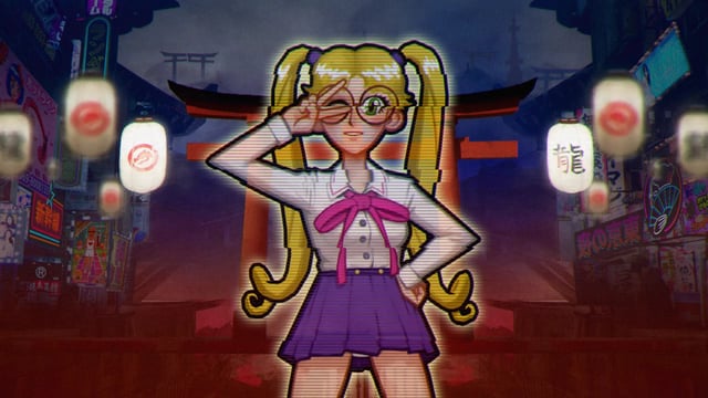
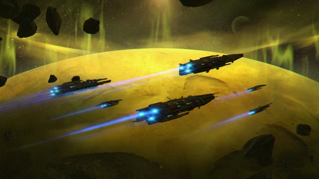
For this project, I also created the game's loading screens in AfterEffects. These should express the theme of the world. I used artwork created by the concept artists, created depth and added effects to the videos. I had to keep them short and seamless to avoid large video sizes.
The effects used, like displacements and chromatic aberrations, were used to create a glitch effect.
